Insights
If Google cares more about mobile than desktop for your site, why don’t you?
Rich Willner
Published: March 2, 2020
TL;DR
Google now primarily rates and ranks web pages on how they perform and what they say based on the mobile phone version of the website, not the desktop version. Use their tools to check out what Google thinks of your site and adjust accordingly.
From the top please
Google scans every webpage it can find to access them against a huge range of comparisons, checks and balances.
It does this with a mini program that crawls a webpage, scans it, finds all the links on it and then scans all those pages, finds the links… and on and on. (There is a lot more to it than that but the explanation works for the sake of this article.)
This mini program is called the Crawl-bot, and it works by pretending to be a web browser and building the site for a virtual screen and examining it. The virtual screen used to be a desktop computer screen but now Google has switched to using a virtual mobile phone to scan it. So Google now sees your website as your users do when they look on a mobile, not on a desktop.
Why?
As the internet has grown, the way people use it has changed a lot and the number of mobile users as a percentage of overall users has been growing.
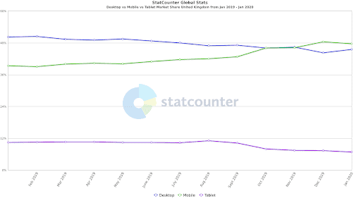
Globally, mobile overtook desktop in November 2016 and in the UK, this happened towards the end of 2019. As at January 2020, the stats showed:
- Mobile 47.6%
- Desktop 45.6%
- Tablet 6.8%
Not much in it right now, but the trend doesn’t seem to be slowing.
So what?
Desktop computers vary wildly, but are generally pretty powerful and have a solid, fast connection to the internet with nice big screens you can fit a lot of information on.
Mobiles are the opposite, they generally have much less power and much shakier internet access. Also, thumbs and fingers are far less precise than mouse cursors, so it’s harder to be accurate on mobiles.
Google knows this so sets the bar pretty high when it comes to mobile friendliness. Therefore, your website’s score in this area is an important factor in where you rank in organic searches.
Will it really make a difference?
Let’s take a real world example: The search term “Restaurants in Norwich”.
According to Google Keyword Planner, this term receives 18,100 searches a month.
Now let’s look at average click-through rates based on organic search position for the UK in Dec 2019:
Let’s run the numbers that really matter: the potential impact on sales.
| Organic search ranking | 1st | 2nd | 3rd | 4th | 5th |
| % clicks * | 35 | 16 | 9 | 6 | 4 |
| Est. clicks (from 18,100) | 6335 | 2896 | 1629 | 1086 | 724 |
| Est. conversions (3%) | 190 | 87 | 49 | 33 | 22 |
| Est. value (£80 pc) | £15000 | £6950 | £3909 | £2606 | £1738 |
| Loss of dropping a position | £8050 | £3041 | £1303 | £868 |
The impact is dramatic.
Dropping one place for a keyword with reasonable volume from 1st to 2nd could cost you £8k per month; from 2nd to 3rd could cost you £3k per month. Having a non mobile-friendly site will work against you for ALL keywords, so multiply that number by 20? 50? 100? The numbers soon add up to something you can’t ignore.
What you can do
Luckily, Google provides a few different tools to help us find out what it thinks of your site.
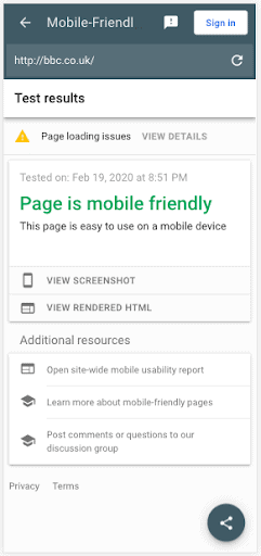
Step 1: The Mobile-Friendly Test
This is the easiest one to do and provides a pretty simple pass or fail.
Step 2: Web.dev
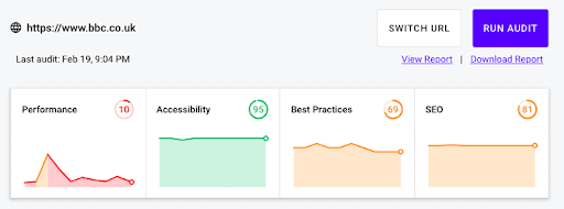
Web.dev is a site-scanning tool created by Google. Type in your site address and out comes some important data.
The tool scans multiple areas as you can see, but performance is the one we are looking at right now – and bbc.co.uk is coming up short. Below those graphs are a range of site speed times.
We don’t need to go through all these in detail but the First Meaningful Paint and the Time to Interactive are worth looking at.
First Meaningful Paint
This is the first time a user sees something helpful on the screen to know the site is loading. When all they see is a white screen, users tend to try another site pretty quickly (within 3 seconds on average).
Time To Interactive
Once the content has loaded people want to start using your site and that time is measured here. Everything has been downloaded and used by the browser and the site is ready to use.
Recommendations
Below the speed speed times will be a list of recommendations. They tend to be a little technical but the big ones to watch out for are:
Images: People often use the same images on desktop and mobile and they are often very big. A large high-quality image for desktops can often be 4Mb. To put that into perspective that could be a load time of 10 seconds or more on a 3G phone connection for just one image. Now consider this if you have five images in a slider…
Browser caching: Your website is made up of dozens, hopefully not hundreds, of different files, many of them reused between pages. Caching tells browsers to keep a copy of them so they don’t have to download the same files over and over.
It doesn’t help the first time you visit a site but it can make a massive difference on subsequent pages.
Gzip and Minification: These are methods of optimising the files to be sent from computer to computer. Smaller files mean less to transmit which leads to faster page loading so strip out anything not important and compress the files into the smallest possible for transmission.
For these last two, you’ll need to either talk to your developer or, if you use WordPress or similar, then you might be able to install a plugin to do this for you. The most popular for WordPress are WP Rocket, W3 Total Cache and WP Super Cache.
In general you’ll struggle to implement many others properly without professional help.
Step 3: Google Search Console
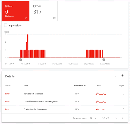
This is Google’s ultimate tool for mobile checking. If you have it set up on your site, sign in and click “mobile usability” from the options in the sidebar. You will get something that looks like this:
This will show you any pages containing errors. In the above site Google has found a few issues on the site recently (although none at the moment). These are specific and by clicking on them you will be guided through where the issue is.
If you can fix these yourself, brilliant. Once you have done it you can click “validate fix” and ask the crawl-bot to rescan.
If this all seems a little too much, talk to a specialist agency who can help you audit and fix your site for a lot more than just mobile usability.
Does this all matter for Google Ads?
Absolutely. Google Ads are given a quality score and you’ll pay more for your ads if your site delivers a poor user experience.
Summary
Google doesn’t rate websites from a mobile perspective for fun. It knows that better mobile sites perform better, so even if you don’t care about your organic search rankings use Google’s tools to help you provide a better mobile experience to your users.
And stay a step ahead of your competitors.


